Jason M. Barr February 20, 2018
On a recent Saturday, my wife and I stopped into a burger joint on the Upper West Side of Manhattan; nothing fancy, but not a dive either. Two burgers, a side of fries, and two beers. The total, with tip and tax: $75. When did lunch get so expensive?
There are any number of reasons why a mid-range place like that would charge so much, but in the end, it comes down to handful of possibilities. The neighborhood has plenty of restaurants and pubs, so it can’t be that this one has a monopoly on burgers (though, their burgers are good).
Therefore, it must be the cost of one of the other inputs–land, labor, or capital. I’m sure the waiter isn’t earning much above the tip; and, as for capital, we’re talking about a kitchen and a bar, not a high tech Gigafactory. Thus, I conclude, the cost of serving ground beef on a bun with fermented barley is tied to the rent in this high-traffic area.
Adam Lends a Hand?
Yet, one of the hallmarks of a market-based economy is the self-regulation property. If the price of a good shoots up, it triggers a series of incentives that then cause the price to fall or moderate its upward trajectory. The gentle prodding from a large-but-caring invisible hand (I like to think of it as one of those oversized foam hands that you see at football games) is supposed to guide our way to economic efficiency.
For example, if the price of oil spikes because of high demand, then the economic gears start to churn. First is that suppliers will tap into reserves that were previously too costly to extract, or they will seek out substitutes, such as natural gas, or solar and wind power. Consumers, faced with high prices, might drive less or buy fuel-efficient cars; the reduction in demand, combined with the increase of supply, will cause the price to return to some reasonable level. At least in theory.
This got me thinking: what have been the relative prices of various types of inputs over the long run, or at least since after World War II; and what do they suggest about our access to vital economic resources?
Name That Index! Round I
To this end, we are going to play a game: Name that Index! Round I is called Guess that Commodity! I will present a graph with three different commodity price indexes and you try to guess what they are.
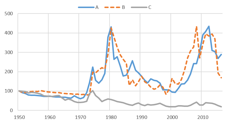
Before we proceed, a few things to keep in mind. First, each of these price indexes are set so they start at a value of 100 in 1950. Second, they are adjusted for inflation; which is to say, each index tells the relative price of a good compared to the general price level (the Consumer Price Index). For example, if a good’s price rises exactly at the same rate as the general price level, the index would remain constant at a value of 100. Figure 1 gives the three series.
I will give you a clue: A is a solid, B is a liquid, and C is from a plant. Before you guess, however, consider the following observations. Though A and B move in nearly lock-step (which surprised me), only one is a necessity for modern survival and other is not. For item A, I would argue, most people are happy when the price goes up and annoyed when it goes down. For item B, the reverse is true.

What strikes me is that the long run movements of both A and B seem to vindicate the invisible hand theory. Large price spikes are eventually met with large declines; so much so, that there is no apparent upward trend. The plant product also corroborates the theory, as its long run movement has been downward. Today, its real index value is around 20—an 80% decline since World War II!
Do you have your guesses ready?
The answers: A is gold; B is oil; and C is wheat.[1]
Round II: Land, Labor, or Capital?
Round I was about natural resources. Round II now presents prices for the other economic inputs. Ready to play?
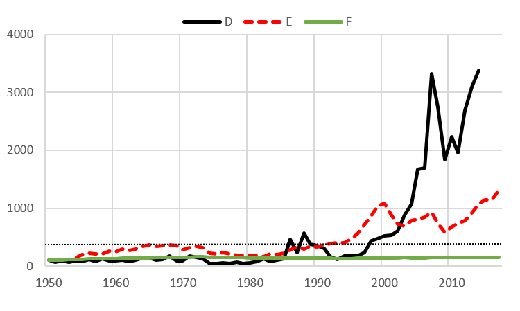
Figure 2 gives three indexes; one is a measure of land (of a very specific place), the next is labor (the wages of workers), and the other is capital, which in this case, are stock prices. Recall that stock prices reflect the income to those who own the capital, after the owners of labor, land, and natural resources get their payments. The figure also includes a line at 500 as a benchmark; the peak value for oil and gold was in the 400s; and never hit 500.

Ready? Here are the answers.
F, the green line, is the price of labor. It started at 100 in 1950 and is only at 158 today. The red line, E, are stock prices as measured by the Standard and Poor’s 500 stock index. It went from 100 in 1950 and is at about 1300 today.
The black line is the price of Manhattan land. This index was recently created by me and my co-authors, and was determined by analyzing the sale prices of nearly 3600 vacant land sales on the island since 1950. By looking at land without any buildings, we can get a cleaner estimate of the price of geography, without having to worry about the value of a building that normally sits on top.
Based on our analysis, the price of land went from an index value of 100 in 1950 to 3384 (as of 2014), which was three times greater than the stock price index!
Keep in mind, however, that these three price series should have a trend, because, more or less, they are tied to economic growth, which is driven by technological change and productivity increases. Since 1950, the real Gross Domestic Product (GDP) index went from 100 in 1950 to 765 in 2016. Labor failed to keep up, while land and capital did much better. (Sources for all the price series data can be found here.)
Let’s Play Monopoly!
Today, one of the most pressing issues is that of income inequality. While there are many theories about why it is rising in the United States, one of the most-commonly discussed is that of monopoly power of the owners of capital.
The idea is that the shareholders of American businesses–in cahoots with their highly-compensated minions, who manage their companies for them (i.e., CEOs, CFOs, etc.)–appropriate the value of workers’ output for themselves, leaving them with lower wages. There is strong evidence for this theory. The rising stock market, then, would reflect this power to reallocate more of a company’s income.
Even so, based on our estimates, the rise in the price of Manhattan land has far surpassed the rise in stock prices. This suggests, in a way, that the monopoly power of property owners is greater than that of equity investors.
Corporate owners and CEOs have gotten their power from globalization, reduced unionization, and lower income tax rates that begun with Reagan, continued under George W. Bush, and resumed under Trump. But what about landlords? I would argue that their power comes from restrictions placed on real estate construction set by New York City, via zoning rules, and rent stabilization. In short, New York has placed cuffs on the invisible hands in the housing market.
And who are the “guilty” in driving land values so high? You and me. Anyone who comes to New York City to live, work, or play is helping to drive up the price of land; and inadvertently increasing income inequality by giving more monopoly income to property owners (including homeowners, condo buyers, and landlords of rentals).
The way to break this monopoly power is to increase the supply of housing, which will then make it more affordable. New York City is going to have to build upwards if it is genuinely concerned about income inequality. Chew on that the next time you bite into a $20 hamburger.
———–
[1] I would add two caveats to the conclusion that the “invisible hand” of capitalism works for these commodities. First is that for oil, the price is likely too cheap in the U.S. because it does not fully reflect the CO2 externalities that produce climate change or that increase traffic congestion on America’s roads. Second is that we must be mindful of Keynes’ quip that “in the long run we are all dead.” Price spikes with oil, for example, do eventually fall, but sometimes we must wait a long time.