Jason M. Barr and Troy Tassier February 25, 2021
The Great Equalizer?
In March 2020, during the salad days of the COVID-19 pandemic in the U.S., many people, from Madonna to New York Governor Andrew Cuomo, believed the virus was a “great equalizer,” hitting rich as likely as poor, and White as likely as Black or Hispanic.
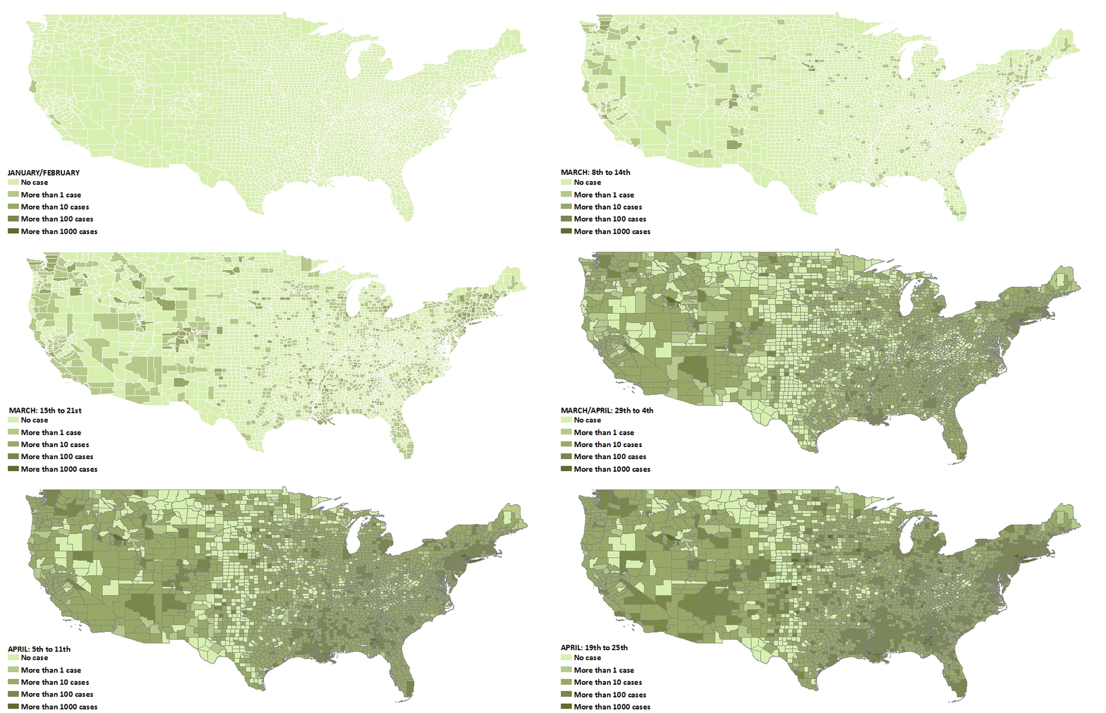
In short order, however, it became clear that these pronouncements were wrong; people of color and the poorer members of society were hit at rates over their proportion in the population, particularly in the large cities of the Northeast as well as New Orleans and Detroit. As the great equalizer myth faded, another belief rose in its place—that population density would determine the pandemic’s course. In March, few COVID-19 cases could be found in the sparsely populated rural interior, while New York City was flooded with new cases and deaths.
The Bronx is Burning
By mid-April, the State of New York alone had more cases than any country outside the U.S., with the majority in the New York City metropolitan region. When this happened, curiosity into what was unique about New York soon followed. The frequently repeated response: its density. New York is, by far, the densest city in the United States, with 28,000 residents per square mile (10,811 per km2); San Francisco is a distant second at 17,000 (6,564 per km2).
Further singling out New York was its extensive public transportation network. Its subway alone carries five million riders per day. As a comparison, Los Angeles’s subway and rail system takes two weeks to hit this threshold. New York was accused, as it were, of being New York—unique and apart from the heartland—which gave the rest of the country a false sense of security.
But soon that would change—cases spiked in the heartland and south during the summer, followed by a cascade of infections washing over urban, rural, and suburban places alike. As a new spring approaches with cases, hospitalizations, and deaths dropping rapidly, along with the limited arrival of vaccines, it seems as if the great waves of the pandemic are receding with the hope of calmer seas and possible herd immunity by summer.
The Early Role of Population Density
In the early weeks of the pandemic, few items were more discussed than the role of density. We took part in the discussion, as well, by offering an early critique of its importance. We used the metaphor of lightening striking cities before rural areas because large cities are hubs of tourism and international travel. Our argument was that while density was important, it was not the only determinant of the epidemic. New York and other cities were first because dense places are also central places in the global economy. In this case, people were confusing correlation for causation. The high transmissibility of coronavirus meant it was going spread widely and soon; no region was safe.
Nonetheless, density should play a role in the spread of an epidemic. Density unchecked is the antithesis of social distancing. More people in tighter spaces lead to more contacts and more opportunities for infectious diseases to spread. It is not a question of whether density is important or not, but rather of its relative magnitude and how its impact may change over time. Others have also investigated its role.
Researchers at John’s Hopkins University performed the best-known study. Using data on 900 counties in U.S. metropolitan areas, they found that a city’s overall population size was correlated with more cases of coronavirus, but a city’s density (people per land area) was not. In other words, if a city has a large population, there will be more cases, on average, regardless of whether the people are sparsely or tightly packed together within the city. Some studies noted the role of density as a primary predictor of the epidemic in the U.S., while still others were more nuanced, claiming, as we did, that density matters but was not the sole factor in the epidemic’s spread. Studies from countries around the world have found mixed results as well (see here and here.)
Month to Month
One common feature of the studies, however, is that they all use data from the early part of the pandemic, with analysis ending by the early summer of 2020 at the latest. But how did the virus spread since then, and what role did density play month after month over the past year? Were people of color and the poor continuing to suffer the brunt of the pandemic throughout the year, or did the brunt of the impact change over time?
To understand how and why the virus spread, we have performed an analysis over the past 12 months. When we do this, we see the pandemic’s changing impact, with waves crashing on different groups at various times over the year. The resulting impact was that all groups got hit but at unequal levels and during different times.
We expand on the studies discussed above by performing a statistical (regression) analysis that looks at the role of density, and other factors, up to February 1, 2021 (data sources and results here). We use county-level reported coronavirus cases from USA Facts. The goal is to see how the monthly increase in cases can be “explained” by density, race, and poverty. Our method allows us to perform a kind of “hot-spot analysis” to see which key drivers statistically explain coronavirus growth rates each month and how these drivers’ impacts evolved.
Our results give the percentage change in coronavirus cases associated with a 1% change in a variable. Economists call this the elasticity. Larger values mean that the variable of interest has a larger percentage impact on new cases. If a particular variable has an elasticity of 0.5, it means a 1% increase in that variable is associated with a 0.5% increase in coronavirus cases, on average. If the elasticity is one, then a 1% increase in that variable is associated with a 1% increase in coronavirus cases, on average.
The Density Effect
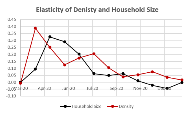
Figure 2 plots the monthly elasticity for density on the number of cases for the pandemic’s first twelve months. If we look at the effect of density throughout the epidemic, we see that it was most important in the initial months. The most significant impact of density appears during the second month because of where the epidemic was first located, in northeastern cities and other metropolitan centers like New Orleans and Detroit. As the epidemic continued, the role of density becomes less important.
Household Size
A second, more localized aspect of density is the average household size. Early on in the pandemic, it was recognized as an key influence in New York City in academic research and the general press. Other studies noted the link more broadly across the U.S. and the world. Household size is more nuanced than the broader concept of population density and has its own avenues for increasing infections. The effect of household size relates to both density within a home once an infection is present, the number of opportunities for an infection to enter the home, and the breadth of access to diverse places outside the home where infections are possible. In addition, household size, on average, is positively correlated with more density surrounding the home and with poverty.
The studies mentioned above, again, use data from early in the pandemic. If we look at the effect over time, we see that the impact of household size, or localized density, peaks in April when it becomes the largest factor in the U.S. epidemic. Like the density, it also falls off after that point in time.
Race and Ethnicity
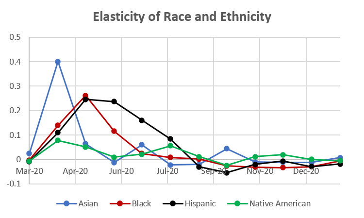
If we return to our elasticity measures, in Figure 3, we see a similar story for race and ethnicity. In the initial months, counties with larger proportions of Asian, Black, and Hispanic people were hit hardest, with this initial wave cresting by May. After that, the measure of elasticity for counties with larger minority populations began to decrease. By July, the elasticity measurement for percentage of Asian and Black residents within a county was approaching zero.
The elasticity of percentage of Hispanic people within a county, however, decreased at a slower rate, only being equal to zero by September. Counties with higher percentages of Native Americans had a slightly different path during the epidemic. After an initial peak in elasticity similar to other groups discussed above, counties with larger native American populations had a second elasticity peak in August when the pandemic ravaged many areas in the southwest and the Dakotas, among other more rural regions.
The Poverty Wave
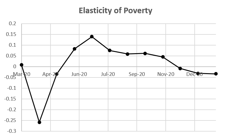
The second peak of cases in the summer is marked by an increase in the elasticity of county-level poverty rates. Initially, in the U.S. epidemic, impoverished counties had lower elasticities. But the effect of poverty within a county peaked in the month of July. Because there are several variables in our regressions that each pick up different aspects of the epidemic, it can be hard to sort out exactly what is happening. Because average household size within a county is strongly correlated with poverty in the county, there is also a poverty factor in the initial wave. But the “poverty wave” shown in Figure 4 is the movement of the pandemic in the early summer to areas with high rural poverty, particularly in the southern states.
The Cresting Wave
As the poverty wave receded, we entered a new wave in the fall. This third wave was bad for everyone and with lower elasticities from race, ethnicity, density, and poverty. This doesn’t mean that we have returned to the pandemic as “great equalizer,” as we make clear below. But we now find that coronavirus infection rates are now more similar across the socioeconomic spectrum than in the early waves of the epidemic. Mortality rates, however, remains unequal.
Excess Mortality
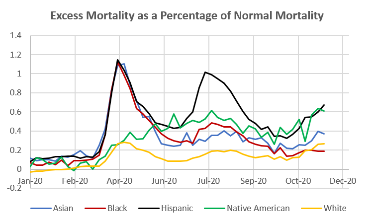
To understand mortality rates, we used data created by the CDC. They calculate a statistic called excess mortality. It measures the number of seasonally adjusted deaths that occur above normal. Below we plot the excess mortality for each of the population groups over the course of 2020 as percentages above normal (epidemiologists call these the “p-scores“).[1]
For example, in April, the percentage of deaths above typical for Asian, Black, and Hispanic Americans peaked slightly above 100%. Combining this figure with our elasticities paints a clearer picture of the waves. Early on, the initial waves hit dense cities, particularly areas with large numbers of ethnic and racial minority groups. As the initial wave receded, a second wave arrived in more rural areas of the country, mainly rural areas with larger percentages of Hispanic and Native American residents and regions that were poorer on average.
For the Hispanic population, the second wave was almost as severe as the initial wave, if measured by excess deaths. While our new-cases regressions paint a picture of the cresting wave, excess mortality continues to be higher for minority groups (excluding the Black population at least through November), particularly for the Hispanic and Native American populations (see Figure 5).
Waves within Waves
The pandemic that struck the United States and the world over the past year has not washed over us equally, nor has it arrived in one constant wave. It has been a pattern of episodes, smaller waves within a big storm, that each have unique characteristics. Overall, the pandemic’s waves and idiosyncrasies have inflicted most harm on the more vulnerable in our society, but even there, the effects have changed over time.
Each wave has held its own unique characteristics and impacts on different groups and different regions. This seemingly ever-changing set of features is not surprising to epidemiologists, who are accustomed to dealing with such idiosyncrasies over time. As epidemiologist Adam Kucharski writes in his book, Rules of Contagion, “if you’ve seen one pandemic, you’ve seen… one pandemic.” We wait hopefully for this one to recede into the history books.
Read more posts on the COVID-19 pandemic and related topics here.
—
[1] These p-scores are highly correlated with our elasticity measures, which can be seen here (in data appendix pdf)
Leave a Reply