Jason M. Barr (@JasonBarrRU) and Sean Franklin September 27, 2021
The 1970s was New York’s darkest decade. The government nearly went bankrupt. A recession that began in 1969 triggered the loss of hundreds of thousands of manufacturing jobs. Between 1970 and 1980, Gotham’s population shrank by more than 800,000 people, while arsonists burned down entire neighborhoods.
In those years, only a true visionary could have foreseen the city’s rebound. Yet starting in the early 1990s, New York began a dramatic resurgence. New service-based industries grew in place of the old factory jobs. Crime rates fell, and the decay and despair that had marked the previous years were replaced with reinvestment and optimism.
Economic growth and a sense of security drew people back so that by 2000 the population had recovered to its earlier peak. To this day, the population continues to increase to new highs. But the laws of supply and demand, being what they are, suggest that, while the city can hold more people, it cannot build fast enough to keep up with demand. The result has been more homelessness, increasing affordability problems, and greater income inequality.
Despite these issues, the questions remain: How has New York’s housing stock changed over the 21st century? Has it grown or shrank? If so, where and why? Which neighborhoods are punching at their weight, and which ones are not doing their part in the great housing game? To this end, we looked at changes across the Big Apple over the roughly two-decade period from 2002 to 2020 (pre-pandemic) to better understand how and where New York is housing its people.
The answers might surprise you.
Counting Houses
One of the benefits of being interested in New York City’s housing market is that city agencies have been on the vanguard of providing large data sets to the public. One is particularly relevant—the Primary Land Use Tax Output (PLUTO) file—which is online going back to 2002. The PLUTO file includes information about every tax lot in New York City and tells, among other things for each one, the building type, how many housing units it contains, the building height, and so on. The file allows for a very detailed look at the changes in Gotham’s housing supply.
Housing unit additions can appear in three ways: First is through new construction. The second is from the splitting up of extant units within a building. For example, a one-family house can be subdivided into a two-family house. Lastly is through building conversions, where, for example an old office or loft building is refitted for residential use. The critical point is that we cannot solely rely on new construction measures if we truly want to understand the changes in housing supply. A flexible housing market will depend on all three.
For that matter, there are forces that can shrink supply: Buildings can be demolished, residential units in the same building can be combined, or buildings can be converted to other uses. Thus, the net housing changes across the city depend on both the “adding” and the “subtracting” forces.
Two Decades In
In 2002, the city had about 3.2 million housing units. By 2020, that number was just over 3.6 million units, a growth rate of about 13.5%. In the same period, New York’s total population grew by about 10%. On the surface, this seems promising; the housing stock increased faster than the population.
But the difference of about 3 – 4% is problematic on several fronts. First, a healthy housing market should have a reasonably high vacancy rate, say between 7-10%. The market should have enough available units so that new people coming in and those switching their housing all have enough choices and are not duking it out over just a handful of options. Before the pandemic, the city’s overall rental vacancy rate was 3.3%, and 10.5% of rental housing was overcrowded. Furthermore, the vacancy rate for rent-stabilized units was a minuscule 2.06%, while private, non-regulated units were vacant at a 6.07% rate. Consider that about two out of every three New Yorkers is a renter, and 58% of rental units are regulated or rent-stabilized.
Second, a relatively high number of units—especially in Manhattan—are used as a pied-à-terre or second home, which remain empty for a significant fraction of the year and are not available for residents. One estimate puts that figure at 10,415 units for Manhattan. While that is only 1% of all Manhattan units, it’s another source “removed” from the local market. This issue is likely made worse by Airbnb, where visitors can soak up “slack” housing.
Household Size
Additionally, the “desired” household size has been shrinking over time. As incomes rise, people are less willing to shack up with roommates, and they want more space. Also, the composition of households is changing. The proportion of traditional nuclear families with two spouses with children has dramatically fallen. In contrast, households of couples with no children and single-person households have grown in their place. All these various demand-side changes put pressure on New York’s housing stock.
Given the overall difficulty in building, new construction appears mainly at the higher end of the market. So, the average net difference between the population and the housing stock growth might not reflect housing access across all groups. As a hypothetical example, it may be that the net growth in housing units relative to the population for the upper-income households is 10%. At the same time, for the lower-income folks, it is 1%, leaving an average difference of 4%. And while recent research shows that even high-end high-rise apartment building construction helps reduce prices, its impact on lower-income residents is less direct.
A way to understand the relative growth in the 21st century is to look at another time in New York history when the population grew rapidly while maintaining relatively affordable housing prices. Census data from 1910 and 1930 reveal that New York City’s population grew by 45% in the two-decade period, while the number of households (our measure of housing units) grew by 78%. Prorating that to the 10% population growth seen in the 21st century would suggest housing stock growth would need to have been at least 17% to keep prices in check (assuming, as well, that housing is broadly created for those across the income spectrum).
In short, when we consider all the forces as work, a net gain of housing units of about 3-4% higher than the population growth shows that housing supply is not matching demand across the entire income spectrum.
A Tour Across the City
What has happened to New York’s housing stock across different neighborhoods since the beginning of the 21st century? Using our data set and focusing on the city block level, we created three categories. Category I is “Lost Units.” A block in this group had six or fewer units in 2002 as compared to 2020. Category II is “No change.” Being in this group means that the block was within plus or minus five units over the two-decade period. Lastly, category III is “Gained Units,” which means a block added more than five units. The five-units cut-off is admittedly arbitrary but seems reasonable to understand better changes in units over time: loss, about the same, or growth.

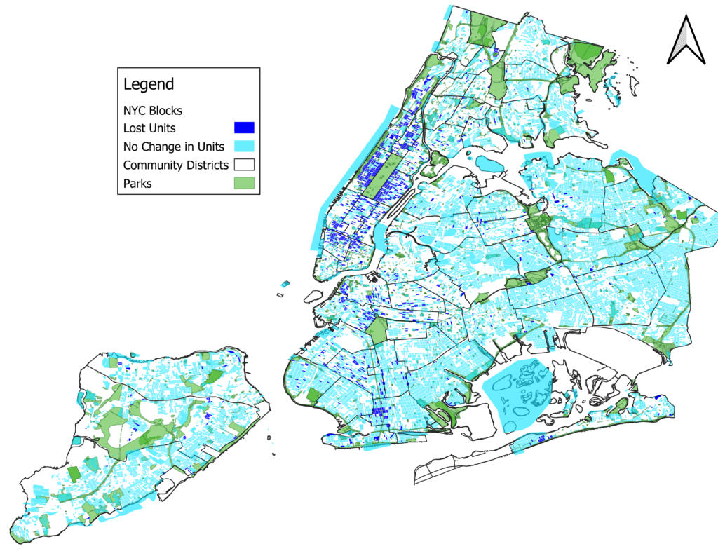
We then created a map of New York City, which shows, for every block, if that block either stayed the same or lost units (the “Gained Units” map is here). In a growing and flexible city, we would expect to see many neighborhoods “share the burden” to accommodate that growth. But in fact, we see something very different. The vast majority of New York City over the 21st century either lost units or remained about the same. Of the approximately 29,000 city blocks, 75% saw either no change or a loss of units, with 4% of those losing six or more units (14% of blocks lost one or more units–see map below). Only 25% of blocks saw an increase in six or more units. In short, the block-level analysis shows that much of the city is quite static, unwilling or unable to pony up more housing.
Loss Clusters
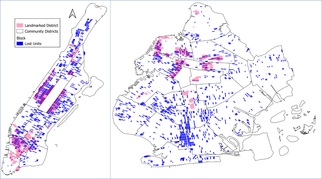
If we zoom into the clusters that lost housing, we can see that they are mainly in Manhattan and Brooklyn. One set of loss clusters—the Upper West Side, the Upper East Side, and Greenwich Village in Manhattan and Brooklyn Heights and Park Slope in Brooklyn—have many landmarked historical districts. It appears that landmarking residential neighborhoods is a great way to shrink the housing stock.
Likely, because of their charm and the limits to new construction, wealthier people move in and then combine units. Brownstone buildings with, say, eight apartments could be bought and converted to a single-family dwelling, or someone could buy two adjacent apartments and combine them into one. The takeaway is that while landmarking may be a way to preserve the city’s built heritage, it comes with a price: Less housing for everyone else.
The third “loss cluster” is southern Brooklyn, particularly in the Gravesend and Sheepshead Bay areas. Stephen Smith, a New York housing expert and blogger at Market Urbanism, has written on this phenomenon in the Observer. The neighborhood has emerged as an ethnic enclave for Syrian Jews, who are tearing down older two-family homes and replacing them with single-family ones or are combining lots to build one house in place of two.

What Drove Changes in the Housing Stock? A Block Level Analysis
More broadly, besides landmarking, what can help account for changes in the number of housing units, at the block level, across the city, on average? To do this, we performed a statistical (regression analysis) that looks at the factors likely to be driving changes (or not) on each block. The analysis looks at characteristics of blocks and neighborhoods in 2002 to see which are predictors of the relative changes in housing units over the two-decade period. (The data and the statistical results can be found here.)
The analysis shows that historical landmarked residential neighborhoods are “bad” for housing stock growth, as the maps suggest. For example, a block with ten landmarked properties in 2002 lost 2-3% of its housing units two decades later, on average. Interestingly, however, landmarked commercial districts had the opposite effect. Those areas that were formerly retail, lofts, or businesses, and were landmarked, saw their housing stocks grow because the insides were converted to apartments. However, the number and size of residential landmarked districts are much greater than the number of commercial landmarked districts, so the net effect of landmarking was to decrease the housing stock.
A Heavy Lifting Index
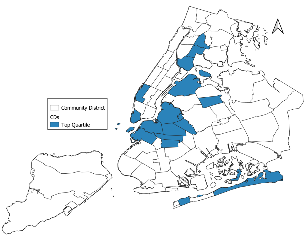
The statistical analysis lets us create a “heaving lifting index” that shows the community districts that saw significant construction. The map below shows the community districts in the top quartile for proportionally adding units, all else equal. They tend to be in the densest parts of the city (and in gentrifying neighborhoods, see below).
But within these neighborhoods, most of the increases in the housing stock came from “low hanging fruit” lots, what one might call the non-NIMBYable blocks. That is, most of the blocks that saw housing unit growth had formerly been those with many commercial/non-residential structures or were parking or vacant lots. In other words, residential districts in 2002 were more likely to lose units over the two-decade period than their more commercial counterparts. The results strongly suggest that once a block is converted to residential use, its prospects for adding more housing are bleak.
Finally, the results also show that those neighborhoods with more generous zoning provisions added more housing. Here we look at the average allowable floor area ratio on each block in 2002, where the FAR measures the total allowable building area per square foot of land. We find that, on average, a block with a 10% more generous FAR led to 1.2% more housing, all else equal. Not a huge number, but it suggests that restrictive zoning is bad for the housing supply. (We leave for future analysis the causes and consequences of rezonings on New York’s housing supply.)

The Gentrification Effect
One of the most contentious issues for urban America in the 21st century is gentrification. The renewed desire for young professionals to live in the city has meant that some lower-income neighborhoods have seen an influx of high-educated, high-skilled workers. The demographic shifts in these neighborhoods have generated resentment from the old-timers, who see the newcomers as driving price increases, displacement, and changes in the character and feel of their communities.
We wanted to understand how gentrification might be driving changes in New York’s housing stock. To make matters more concrete, we define a census tract as “gentrifying” based on two conditions. First, in 2000, it had an average income in the bottom half of all census tracts in the city. Second, in the two-decade period, it was in the top half of growth in the share of college-educated residents. In short, the idea was to look at those relatively low-income neighborhoods in 2000 that saw a large influx of higher-education residents during the period (the gentrifying neighborhoods map can be found here).
The census tract analysis shows that, typically, gentrifying neighborhoods were associated with a rise in the total number of units. On average, if a census tract was classified as gentrifying, it saw an increase of about 4-6% in the number of units, all else equal.
Recent research has not found strong evidence of gentrification driving displacement. Since gentrifying neighborhoods tend to be more dynamic, the evidence suggests that higher educated folks replace the residents leaving for reasons independent of displacement. Other research has found the rise of “Yuppy fish tanks”—pockets of new construction within the historic neighborhoods. Our findings are consistent with these.
The View from 1250 Feet
Overall, what does our analysis suggest? First, the total growth in the housing stock appears not to have kept up with the demand and increase in the population. While net housing units grew about 3-4% more than the population, this has not been enough to meet New York’s housing needs.
The second is that many neighborhoods lost units over the two-decade period. Much of this loss was in historic districts. In Brooklyn, several loss pockets came from teardowns of two-family homes replaced by one-family homes. While some housing loss across the city is natural in an evolving and dynamic metropolis, the loss we see does not appear to come from switches to other vital purposes, such as for hospitals, schools, or business. Instead, the disappearance is directly tied to upper-income households removing units from the market.
Across the city, only about one-quarter of New York’s blocks added more than five units in the two-decade period. The rest remained about the same or lost units. Those neighborhoods that added their fair share did so by primarily converting non-residential lots to residential use. And much of the new construction occurred in gentrifying neighborhoods in a ring around the heart of Manhattan.
In the next post, we will turn to the relationship between supply and prices to see how they are linked (or not) in the Big Apple’s housing market.
More posts on NYC housing can be found here.
Thanks to Jenny Schuetz for helpful comments on the post.
Very interesting read Jason.
711 west end ave, kept 47 units off the market , some for 10 years. They’ve just started to combine apartments. FYI, 2 two bedrooms + 1 studio now make a 16k a month unit. Where are our city leaders on this?